
Free guide · no signup
True Spring color palette: the colors that work, and why
True Spring is warm first and clear second, at a medium depth. The palette is the warm half of the colour wheel at full strength: coral red, golden yellow, grass green, turquoise. Dusty and icy colors are what drain it.
CostFree
Read3 min
SignupNone
VerdictWarm, clear, medium
Verdict
Warm, clear, mediumWarm and clear: golden and coral tones lift you, while dusty and icy shades flatten the face
Find your tone: Color season analysis →What makes you a True Spring
True Spring is the season where warmth leads and nothing else competes with it. Skin usually has a golden or peachy cast, hair runs from golden blonde through warm mid-brown, often with natural gold in sunlight, and eyes are warm: green, amber, warm hazel or a teal-leaning blue.
Depth sits in the middle, so neither pastels nor near-black are the natural home. What distinguishes True Spring from the other warm seasons is clarity: colors want to be fresh and saturated, the way a colour looks straight from the tube rather than mixed with grey.
The True Spring palette, and why these colors work
Every colour here is warm and unmuted. Coral red rather than blue red, golden yellow rather than lemon, grass green rather than pine, turquoise rather than navy. That is the pattern to carry into a shop: if a colour looks like it has had grey stirred into it, it belongs to a different season.
Warm navy and camel do the work that black and grey do for cool seasons, so a wardrobe can still have anchors without leaving the palette.
True Spring palette
- Warm orange#ff8c42
- Golden yellow#ffd166
- Grass green#5bc98a
- Coral red#ff6b6b
- Turquoise#4cc9e0
- Warm rose#f7a1c4
- Apple green#c3d84a
- Amber#e8b04b
Neutrals
- Ivory#f5efe0
- Camel#c19a6b
- Warm brown#8a6f4e
- Warm navy#3f5d75
Metals: Yellow gold, warm brass, copper.
Most confused with: Light Spring if your colouring is more delicate, True Autumn if it is softer and deeper.
What to avoid, and what goes wrong
Muted colors are the main failure. Dusty rose, sage, mushroom and slate all sit under a grey veil, and against clear warm colouring they make the face look flat and slightly unwell. The face is bringing clarity that the clothing is not matching.
Icy and blue-based colors fail differently: icy pink, cool lilac and pure white bring a blue cast that turns warm skin sallow. Black is worth naming separately, since it does both at once. Warm brown, bronze or deep olive replace it without the greying.
Telling True Spring apart from its neighbours
True Autumn is the usual mix-up because both are warm. Depth and clarity separate them. True Autumn is richer and slightly muted: rust, olive and mustard suit it, while clear turquoise and coral can look sharp on it. If bright warm colors look energising on you rather than loud, you are Spring.
Bright Spring is the other neighbour, and it holds even more clarity with higher contrast between hair, skin and eyes. If the very brightest colors still feel comfortable, that is Bright Spring; if they tip into costume, True Spring is the better fit.
Start your glow up
SkinPal on iPhone and Android
Next step · SkinPal app
Finally know what your skin needs.
No more guessing, no more wasted products. Take one selfie. SkinPal shows what's going on with your skin and gives you a simple plan to improve it.
What you unlock in the app
- Full face analysisProportions, symmetry and skin, measured from one selfie
- Full skin report cardSee what's good and what needs work, from acne to skin age
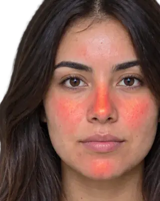
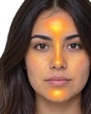
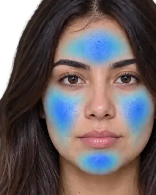
- Heatmaps of your faceSee exactly where redness, oil and breakouts are
- Flare, your AI skin coachAsk anything, get answers based on your own face
- Morning and night routineMade for you, and it changes as you improve
- Ingredient scannerKnow if a product suits you before you buy it
- Progress trackingSee your before and after, week by week
FAQ
Common questions
What colors should True Springs avoid?+
Anything dusty or greyed, such as sage, mushroom, dusty rose and slate, plus icy pastels, pure white and black near the face. All of them either dull the clarity or add a blue cast to warm skin.
Can True Springs wear navy?+
Yes, if it is warm navy rather than a blue-black one. Warm navy behaves like the palette neutral that black is for winter seasons, giving depth without the greying.
What metals suit True Spring?+
Yellow gold, brass and copper. Silver reads cold against golden skin, and platinum more so. Mixed metals work if gold dominates.
How do I tell True Spring from True Autumn?+
Clarity. Both are warm, but Autumn colors are richer and slightly muted while Spring colors are fresh and clear. Hold rust next to coral: one will make the face look grounded and the other will make it look lit.