
Free guide · no signup
Light Spring color palette: the colors that work, and why
Light Spring is warm, light and only gently clear, so the palette is sunlit rather than vivid: peach, buttercup, warm mint, coral pink. The mistakes that flatten this colouring are heavy darks and anything icy or dusty.
CostFree
Read3 min
SignupNone
VerdictWarm, light, gentle
Verdict
Warm, light, gentleWarm and light: sunlit pastels lift you, while black and dusty greys drain the face
Find your tone: Color season analysis →What makes you a Light Spring
Three things decide a season: hue, depth and clarity. Light Spring is light first, warm second, and moderately clear third. In practice that means colouring with warmth in the skin, hair that lands somewhere between honey blonde and light golden brown, and eyes that read light and slightly warm.
The practical test is depth. Hold a heavy black jacket to your face and the eye goes straight to the jacket, because the face has less depth than the clothing. Swap it for warm ivory and the face comes forward. That reaction, not a rule about undertone, is what puts you in a light season.
The Light Spring palette, and why these colors work
These colors share one thing: they carry warmth without heavy pigment. Peach, buttercup and warm mint are all pale but not grey, which matches a colouring that is light but not muted. The pinks stay on the coral side of the line rather than the blue side.
Reach for the deeper members of your own palette when you need contrast, such as soft navy or warm taupe, rather than borrowing a darker season.
Light Spring palette
- Peach#ffd9a8
- Warm coral#ffb5a7
- Buttercup#ffe08a
- Spring green#b8e2a8
- Aqua mint#a5dcd3
- Warm pink#ffc9de
- Sky#cfe3ff
- Light gold#e6d4a3
Neutrals
- Cream#f3e9db
- Light camel#d8c3a5
- Warm taupe#a9927d
- Soft navy#5c6f7e
Metals: Light gold and rose gold. Silver reads cold and flat here.
Most confused with: Bright Spring if your colouring is clearer, Light Summer if it is cooler.
What to avoid, and what goes wrong
Black is the single most common mistake, and it is usually worn because it is the default. Next to Light Spring colouring it creates a contrast the face cannot match, so the jaw and eye sockets read as shadows. Soft navy, warm brown and greige do the same job of grounding an outfit without that effect.
The other trap is dusty colors: mushroom, ash grey, muted mauve. They are not wrong on a colour wheel, they are simply too muted for the clarity in your colouring, and the effect is a face that looks tired rather than lit. Icy pastels fail for the opposite reason, reading blue against warm skin.
Telling Light Spring apart from its neighbours
Light Summer is the season people confuse this one with, and the axis that separates them is hue rather than depth. Both are light and softened. Light Summer is cool: powder blue, lavender and rose flatter it, while peach and buttercup turn it sallow. Hold peach beside lavender and see which one makes the skin look even.
The other neighbour is Bright Spring, which shares the warmth but not the delicacy. If clear saturated coral and turquoise read as energising rather than overwhelming, you sit closer to Bright Spring. If the same colors feel like they are wearing you, Light Spring is the safer home.
Start your glow up
SkinPal on iPhone and Android
Next step · SkinPal app
Finally know what your skin needs.
No more guessing, no more wasted products. Take one selfie. SkinPal shows what's going on with your skin and gives you a simple plan to improve it.
What you unlock in the app
- Full face analysisProportions, symmetry and skin, measured from one selfie
- Full skin report cardSee what's good and what needs work, from acne to skin age
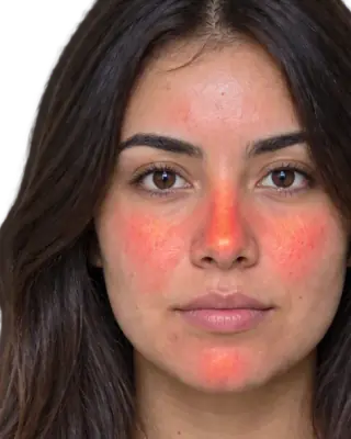
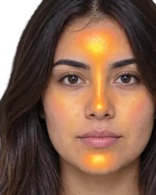
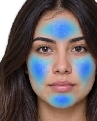
- Heatmaps of your faceSee exactly where redness, oil and breakouts are
- Flare, your AI skin coachAsk anything, get answers based on your own face
- Morning and night routineMade for you, and it changes as you improve
- Ingredient scannerKnow if a product suits you before you buy it
- Progress trackingSee your before and after, week by week
FAQ
Common questions
Can Light Springs wear black?+
As a jacket or a bag it is fine, because it sits away from the face. Directly against the skin it overwhelms colouring this light: the face reads shadowed. Soft navy, warm brown or greige give the same anchor without the drain.
What neutrals suit Light Spring?+
Cream and warm ivory instead of stark white, light camel, warm taupe and soft navy. The test is warmth and lightness together: a neutral that reads grey and cold will fight the palette.
Is Light Spring warm or cool?+
Warm, but gently. The palette is warm-based throughout, though it is lighter and less saturated than True Spring, which is why golden yellows work while deep mustard does not.
What is the difference between Light Spring and Light Summer?+
Hue. Both are light and softly contrasted. Light Spring is warm, so peach, coral and warm mint suit it. Light Summer is cool, so rose, lavender and powder blue suit it. Compare peach against lavender in daylight and the wrong one will grey the skin.