
Free guide · no signup
Deep Winter color palette: the colors that work, and why
Deep Winter leads with depth and stays cool underneath it. The palette is the dark cool range: burgundy, deep teal, midnight violet, dark emerald. Pastels and warm earth tones are what leave it looking washed out.
CostFree
Read3 min
SignupNone
VerdictDeep, cool, strong
Verdict
Deep, cool, strongDeep and cool: dark saturated colors suit you, while pastels look thin and camel dulls the skin
Find your tone: Color season analysis →What makes you a Deep Winter
Deep Winter usually means dark hair, eyes that are deep brown or dark cool green, and skin that can be fair or deep but reads cool or neutral rather than golden. The face carries weight, and clothing that does not carry weight simply loses.
Depth leads, coolness follows. That order is what separates this season from True Winter: a deep colour that is only mildly cool will still work here, while an icy pastel that is perfectly cool can look thin.
The Deep Winter palette, and why these colors work
Burgundy and dark cherry hold the reds without going orange. Deep navy and deep teal give the blues, dark emerald the green, and midnight violet and deep plum the purples this season wears better than any other. Ink works where black would be too flat.
Soft white keeps a light option, with graphite grey, charcoal and black as the anchors.
Deep Winter palette
- Burgundy#6b1f3a
- Deep teal#0f4c5c
- Midnight violet#2a1b4a
- Dark cherry#8a0f2e
- Deep navy#13324b
- Dark emerald#20483a
- Deep plum#4a2545
- Ink#1a1a2e
Neutrals
- Soft white#f2f2f4
- Graphite grey#8b8f97
- Charcoal#2f3238
- Black#000000
Metals: Silver, gunmetal, white gold.
Most confused with: True Winter if coolness leads, Deep Autumn if warmth suits you.
What to avoid, and what goes wrong
Pastels are the first failure: baby pink, powder blue, mint, buttercup. Against deep colouring they look faded and make the face look severe by comparison.
Warm earth tones are the second: camel, rust, mustard and terracotta. They put yellow against cool skin and dull it, which is the classic Deep Autumn palette worn on the wrong colouring.
Telling Deep Winter apart from its neighbours
Deep Autumn is the confusion, and it comes down to hue at equal depth. Burgundy against mahogany is the fastest test: Deep Winter skin looks clear beside burgundy, Deep Autumn skin looks warm and even beside mahogany.
True Winter is the other neighbour. If clear cool colour at any depth feels right, and icy shades look clean rather than thin, you are closer to True Winter.
Start your glow up
SkinPal on iPhone and Android
Next step · SkinPal app
Finally know what your skin needs.
No more guessing, no more wasted products. Take one selfie. SkinPal shows what's going on with your skin and gives you a simple plan to improve it.
What you unlock in the app
- Full face analysisProportions, symmetry and skin, measured from one selfie
- Full skin report cardSee what's good and what needs work, from acne to skin age
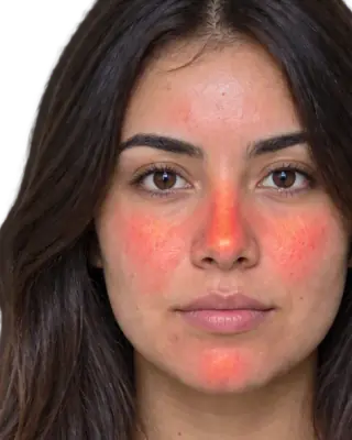
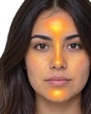
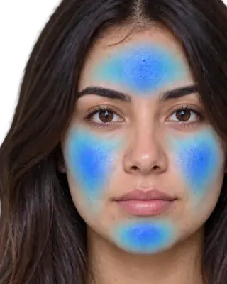
- Heatmaps of your faceSee exactly where redness, oil and breakouts are
- Flare, your AI skin coachAsk anything, get answers based on your own face
- Morning and night routineMade for you, and it changes as you improve
- Ingredient scannerKnow if a product suits you before you buy it
- Progress trackingSee your before and after, week by week
FAQ
Common questions
Can Deep Winters wear black?+
Yes, black is a core neutral here and one of the few seasons where it is genuinely flattering near the face.
What is the best white for Deep Winter?+
Soft white or true white. Cream and ivory bring warmth that works against the cool base.
What metals suit Deep Winter?+
Silver, gunmetal and white gold. Yellow gold can work when it is deep and used as an accent rather than a frame around the face.
What is the difference between Deep Winter and Deep Autumn?+
Hue. Both need depth. Deep Winter is cool, so burgundy, deep navy and dark emerald work. Deep Autumn is warm, so mahogany, forest and dark amber work.