
Free guide · no signup
Soft Summer color palette: the colors that work, and why
Soft Summer is muted first, cool second, at medium depth. The palette is the blue-grey family: slate blue, dusty rose, sage teal, mauve. Anything vivid, and anything obviously warm, is what breaks it.
CostFree
Read3 min
SignupNone
VerdictMuted, cool, medium
Verdict
Muted, cool, mediumMuted and cool: colors with grey in them suit you, while neon and pure black overpower the face
Find your tone: Color season analysis →What makes you a Soft Summer
Soft Summer is the most common season in cooler climates and the most commonly mis-typed, because its defining quality is the absence of a strong quality. Nothing about the colouring shouts: hair is ash or mousy brown, eyes are soft grey-blue, grey-green or soft hazel, skin is neutral to slightly cool.
When mutedness leads, the rule follows naturally: clothing should have the same amount of grey in it that the face does. A colour that is too clean does not look wrong in itself, it makes the face look dull by comparison, and people usually blame the face.
The Soft Summer palette, and why these colors work
Slate blue, dusty rose, mauve and sage teal all sit under the same grey veil. Storm blue and rosewood extend it deeper without adding clarity, and soft moss gives a green that will not go acid. Every colour here would look faded next to a winter palette, which is exactly why it works.
Greige and taupe grey are the everyday neutrals, with soft charcoal navy as the deep anchor instead of black.
Soft Summer palette
- Slate blue#8a92a5
- Dusty rose#a58a92
- Sage teal#7e9490
- Mauve#9e8fa5
- Storm blue#6f8299
- Rosewood#b09aa0
- Soft moss#84937f
- Dusty periwinkle#7c7f96
Neutrals
- Soft white#eceae6
- Greige#b5aca0
- Taupe grey#7b7670
- Soft charcoal navy#3c4654
Metals: Brushed silver and matte rose gold. High-shine metals compete with you.
Most confused with: True Summer if you can take more clarity, Soft Autumn if warmth suits you.
What to avoid, and what goes wrong
High-chroma colour is the first failure: neon, fuchsia, electric blue, clear emerald. They win the contest with the face every time. The second is pure black and optical white, which bring an edge that a muted, moderate-contrast face cannot match.
Warm colour is the third, in the specific sense of orange-based warmth: rust, mustard, tomato and yellow gold. The palette can take a soft warm-leaning tone such as rosewood, but true earth tones tip the skin yellow.
Telling Soft Summer apart from its neighbours
Soft Autumn is the neighbour, and the two are genuinely close because they share mutedness. Hue separates them. Soft Summer stays blue-based: mauve over camel, slate over terracotta. Hold dusty rose beside terracotta and one will make the skin look even, the other slightly ruddy.
True Summer is the other side, sharing coolness with more clarity. If clean mid-tones look good rather than loud, you are closer to True Summer.
Start your glow up
SkinPal on iPhone and Android
Next step · SkinPal app
Finally know what your skin needs.
No more guessing, no more wasted products. Take one selfie. SkinPal shows what's going on with your skin and gives you a simple plan to improve it.
What you unlock in the app
- Full face analysisProportions, symmetry and skin, measured from one selfie
- Full skin report cardSee what's good and what needs work, from acne to skin age
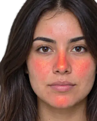
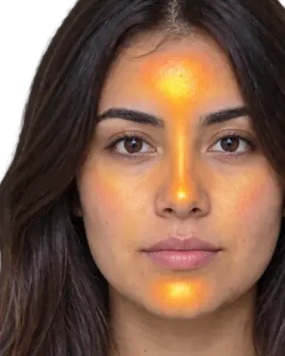
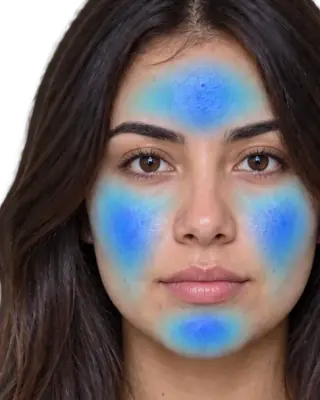
- Heatmaps of your faceSee exactly where redness, oil and breakouts are
- Flare, your AI skin coachAsk anything, get answers based on your own face
- Morning and night routineMade for you, and it changes as you improve
- Ingredient scannerKnow if a product suits you before you buy it
- Progress trackingSee your before and after, week by week
FAQ
Common questions
Can Soft Summers wear black?+
Rarely well next to the face. Black is both maximum depth and maximum clarity, which is the opposite of this colouring. Soft charcoal navy or taupe grey give the same anchor without draining the skin.
What is the best lipstick direction for Soft Summer?+
Muted blue-based pinks and roses: dusty rose, soft berry, mauve. Bright coral and orange-red read as a separate object on the face rather than part of it.
What metals suit Soft Summer?+
Brushed silver and matte rose gold. High-shine metals bring a clarity the colouring does not have, so a matte or satin finish always sits better.
What is the difference between Soft Summer and Soft Autumn?+
Hue. Both are muted at medium depth. Soft Summer is cool, so mauve, slate and dusty rose suit it. Soft Autumn is warm, so camel, terracotta and olive suit it. The mutedness is shared; the base is not.